
Showing posts with label DigiPack. Show all posts
Showing posts with label DigiPack. Show all posts
Sunday, 4 December 2011
Digipak backcover design
We have designed another backcover for our digipak, we have differed this design to the others by adding in legal writing along with the record labels logo and the universal music logo. We have added these logos in to make it more authentic, as from our research we discovered many digipaks involved these features.


Spine

 From our research we have concluded creating an effective spine is an important part of digipaks, this is our first attempt at the spine, we have colour coordinated it with the rest of the digipak as well as including the bands name, and albumn name. The spine also has the bands record company we have added this feature as the majority of professional digipak spines include this.
Legitimate QR code
As a group we have discussed whether to feature a QR code on our ancillary products, to make our digipak and advert more authentic we have created this legitimate QR code. We can have this feature on without it having any copyrights issues.

Wednesday, 30 November 2011
Digipak ideas
This is another possible back for our digipak, we are still undecided on the back cover as of yet, but we have developed this photo by changing the fonts and adding on the bar code along with a QR code.


Friday, 25 November 2011
Digipak Ideas
We have developed this original image we took of the band infront of the sun set, we have changed the colour and contrast of the sky to match the front of our digipak.


Wednesday, 23 November 2011
Inlay draft
 This is a collage I have created with many of the images we have taken. I have created this collage for part of our inlay however this is just a draft and would have to make changes to perfect it such as making it into a proper square. I think we could use an image like this for our inlay as it has a similar effect to the split screen we used within our video. This link could be a selling point in our digipak.
Inlay Ideas
We have taken more images for our digipak and advert, these images are more band related and convey us a band, which differs to our video and that creates the impression we are quite separate. We have taken many images, this is because one of our ideas for the inlay is to create a collage with many images of the band.


Tuesday, 22 November 2011
Inlay features
To make our inlay as authentic as possible I have been researching and analysing other digipaks, to see what is featured.

 The inlay also has a variety of pictures, this make the inlay more entertaining for the audience to read. I like the way they have split the page up into a variety of different images on this inlay page; I think we could do this effectively as our video has elements of split screening in it, so would fit accordingly.Lyrics are once again presented on the inlay.
From looking at other inlays from digipaks, I have noticed many occuring themes used. Many bands chose to use lyrics, (as the Strokes have), bands also quite like to thank their fans within the inlay, sometimes the inlay has sort of profiles for each band members, some inlays are dedicated to certain people, some inlays show images of the band rehursing, (these images usually convey a much more normal image in comparison to the performing image of the band).
For our inlay I think using a variety of these inlay themes would be effective, as research has told us what many indie/rock bands use, we should attempt to be similar to them as it would make our piece more authentic however I also think we could challenge the conventions indie/rock in some sort of way, as this would fit with the indie/independent convention and have something different to other bands.

I pictured the inside of 'The strokes' inlay, through-out their inlay they continuously quote lyrics, this content used by the band maybe would influence the audience to remember their lyrics. However they could have a hidden meaning behind them as well.
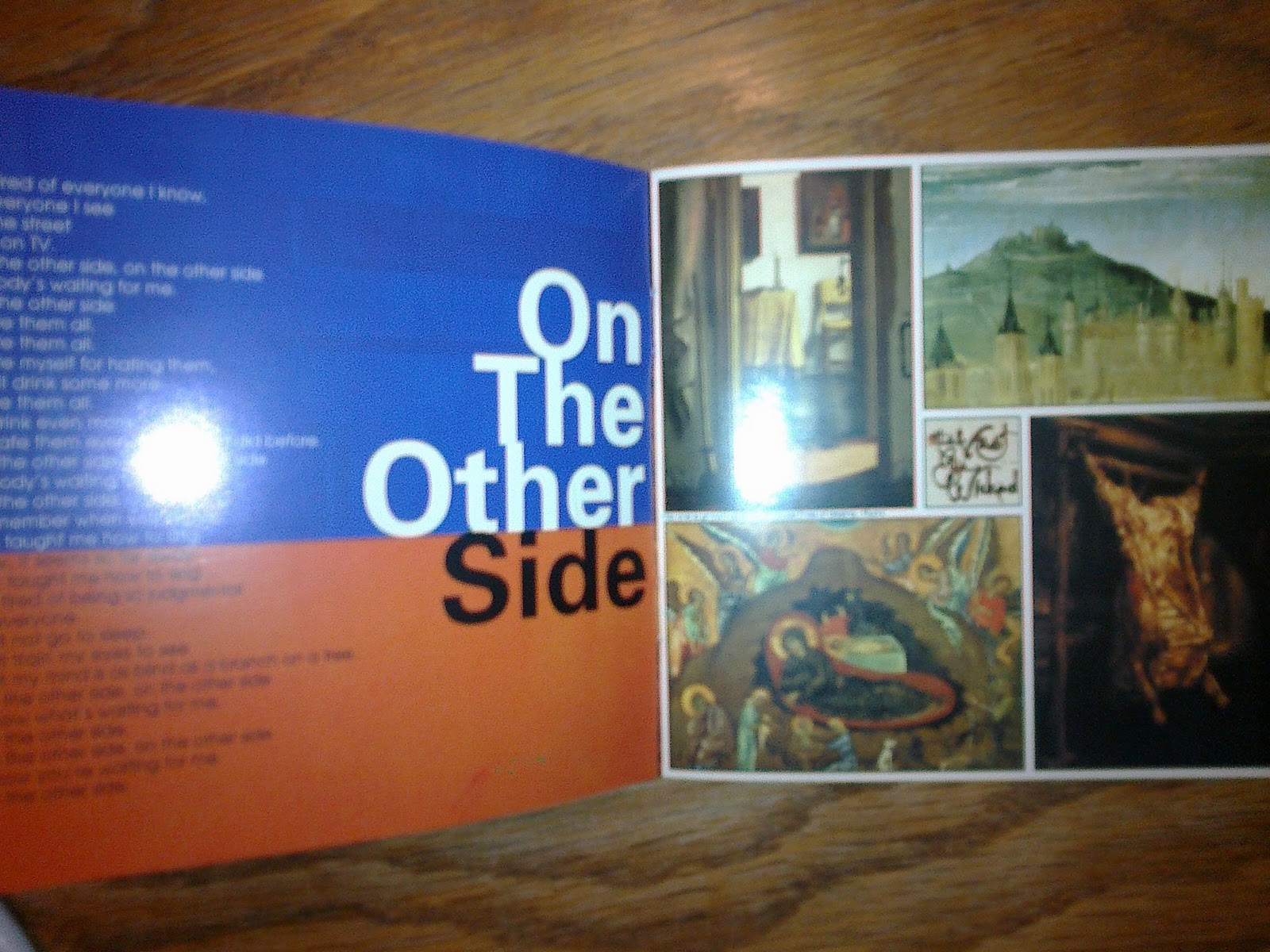
From looking at other inlays from digipaks, I have noticed many occuring themes used. Many bands chose to use lyrics, (as the Strokes have), bands also quite like to thank their fans within the inlay, sometimes the inlay has sort of profiles for each band members, some inlays are dedicated to certain people, some inlays show images of the band rehursing, (these images usually convey a much more normal image in comparison to the performing image of the band).
For our inlay I think using a variety of these inlay themes would be effective, as research has told us what many indie/rock bands use, we should attempt to be similar to them as it would make our piece more authentic however I also think we could challenge the conventions indie/rock in some sort of way, as this would fit with the indie/independent convention and have something different to other bands.
Monday, 21 November 2011
Digipak and Inlay ideas
Using a combination of photoshop, livetype and bridge we have managed to transform a certain text into a sort of platform for the band members.

We started with this plain text using livetype. This image is quite bland and boring, however the western style font would match well with our digipak as it goes with the narrative of the name, 'a long walk home', which can be linked to a western feeling.

We then built on this by changing the background of the text, this added to the image as it made it more exciting and would help draw the audience in.

Meanwhile we took images of each band member, on a plain wall and background, we did this on purpose because we intend to edit these images onto the text, '28 North'.

We then edited the images of each band member and managed to transfer it onto the text, we did this on a plain background to start with as it was just a tester, I think it looks quite convincing at the moment, and doesnt look particulary cheesy.

As a group we all decided on another location to travel to and photograph, we chose this photo to edit our text on, as it is quite plain at the moment, and we like the visuals we get from this photo and the text.

This is our first attempt at transferring the text onto the road, I think the image looks very convincing and not hugly cheesy, however I dont think the colour of the text works very well with the image, I think the colour is too bright and we should have chosen a darker colour, such as a dull grey.

This is our final draft, we have managed to transfer both the text and the band members onto the road we photographed. I like the outcome of the image, and I think it would be a good inlay to have for our digipak, as it involves the band however I dont think this image could be the front of our digipak as it would look a bit too cheesy, also from much research we have discovered that many bands do not chose to have themselves on the front of their digipaks. For the final image I think we should change the colour of the font, and also make the writing more legible.
Further Digipak research
Into further research for digipaks I have been looking at the small print; it is usually located at the bottom of the backcover. Many digipaks represent the company that signed the band.
This is backcover of 'the cat empire', I have circled in red the small print I am analysing.

 The small print tells us the bands website, along with a social networking site that represents the band (myspace). The company that signed the band, 'Velour music''s website is also advertised. The writing also involves the legal wording involved in the making of the digipak and band. It also tells us 'Decca music' distributed the digipak. The logo of velour music is shown, this means its easy for people to recognise the company.
This is backcover of 'the cat empire', I have circled in red the small print I am analysing.

 The small print tells us the bands website, along with a social networking site that represents the band (myspace). The company that signed the band, 'Velour music''s website is also advertised. The writing also involves the legal wording involved in the making of the digipak and band. It also tells us 'Decca music' distributed the digipak. The logo of velour music is shown, this means its easy for people to recognise the company.
For our digipak I think we should involve legal writing as it creates more authencity. This digipak also tells us how the booklet in the digipak has been printed on recycled paper, this may help the digipak reach out to a larger audience.
Digipak ideas and images
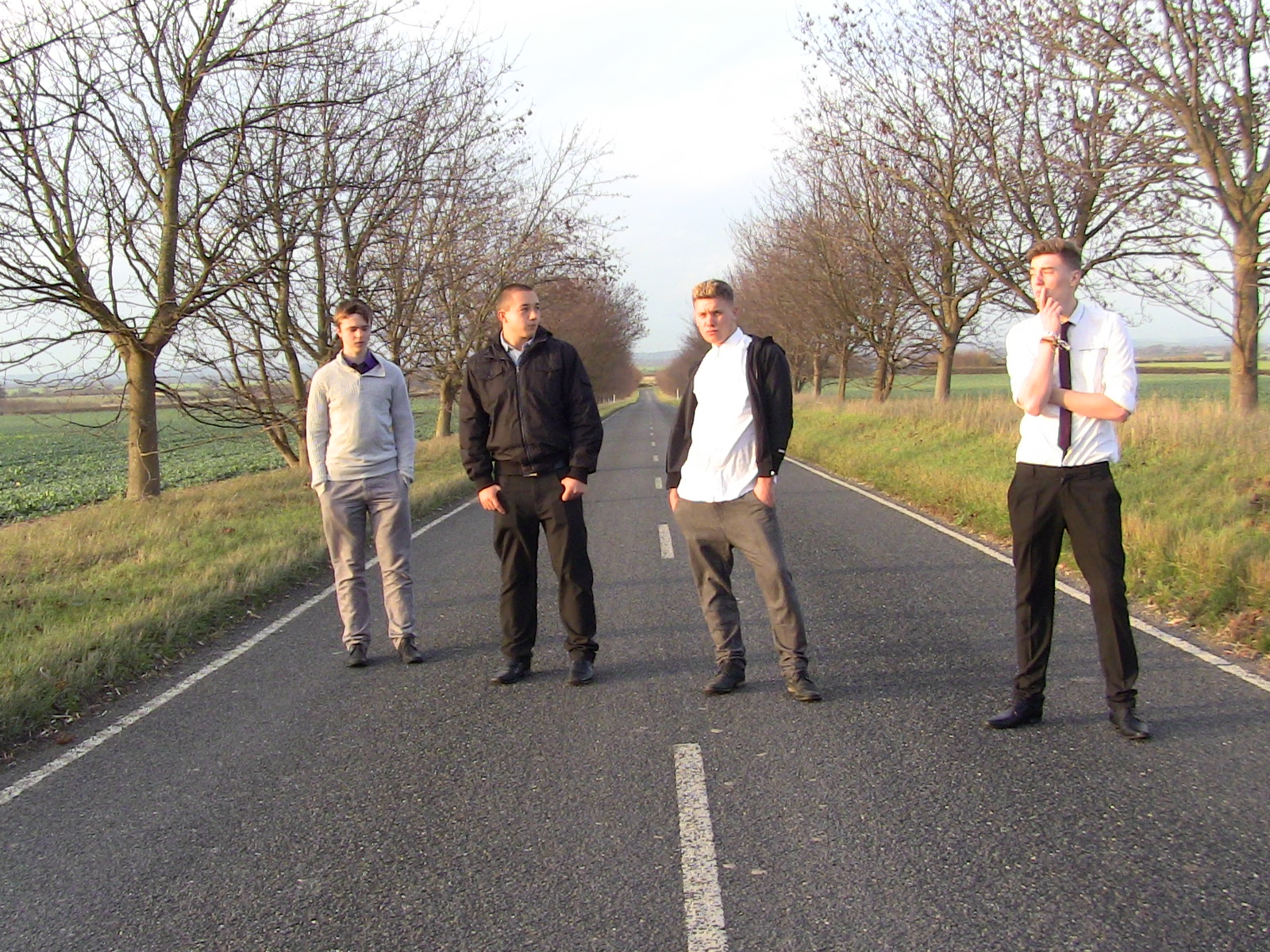
Here are some more images we have taken for our digipak. We have chosen to go with the narrative image of 'a long walk home'. This image of a long walk home is created with the road and emptiness. We chose to take both pictures with and without the band. Some of the band pictures are likely to feature in the inlay of our digipak as from the research on indie/rock digipaks we have found out that most of the time the bands image is not presented on the front of the digipak.



Subscribe to:
Posts (Atom)